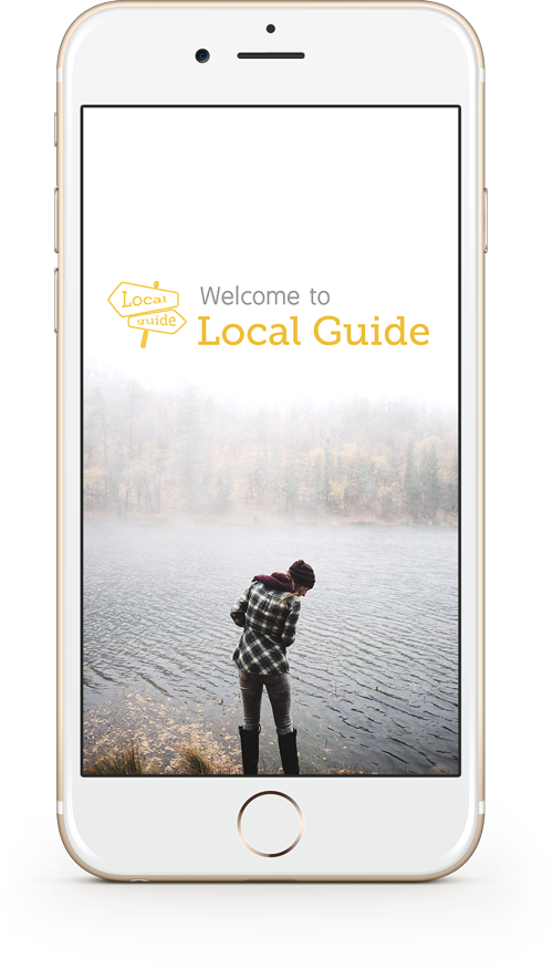
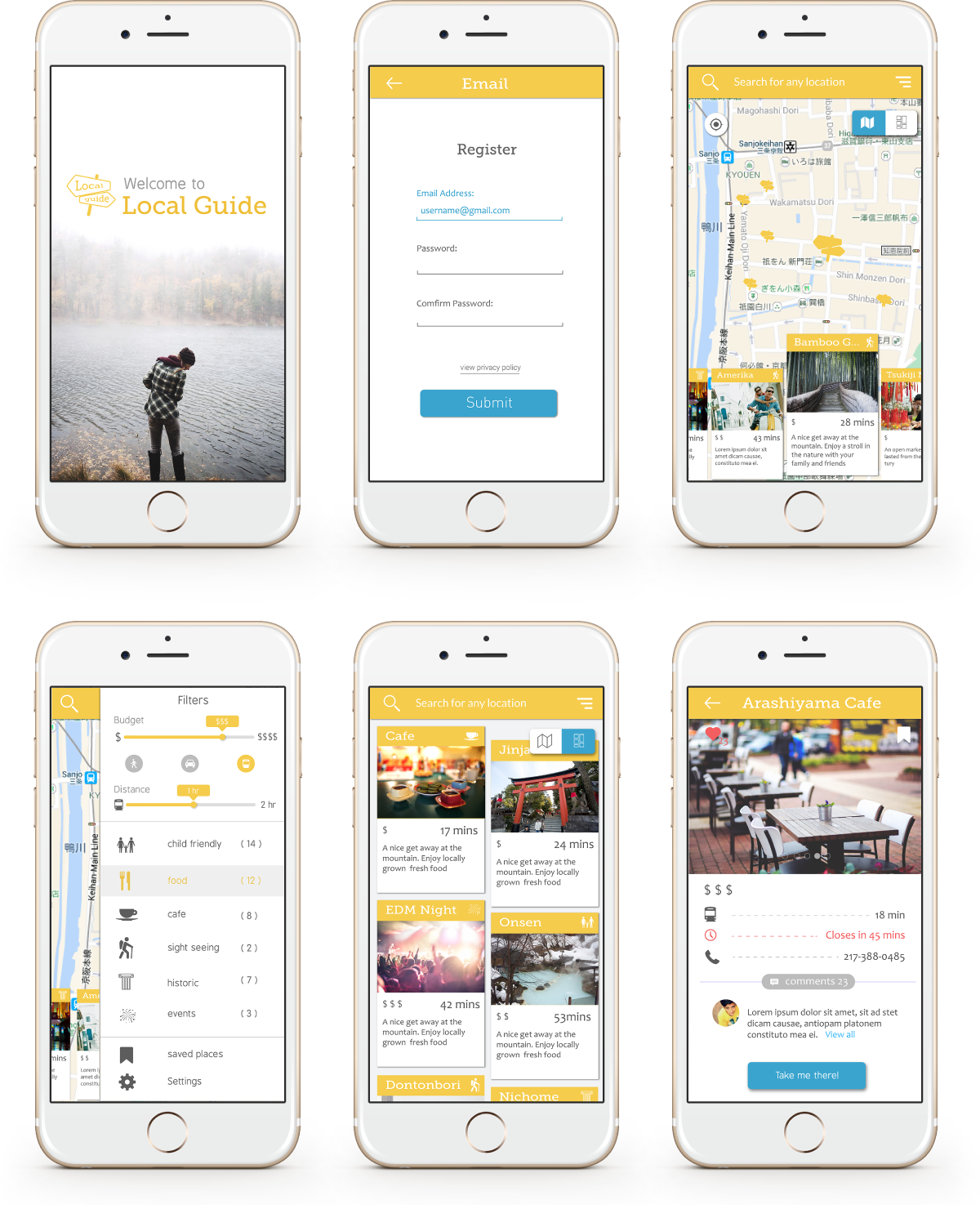
LocalGuide
Role: UX/UI Designer
Client: DESIGNATION
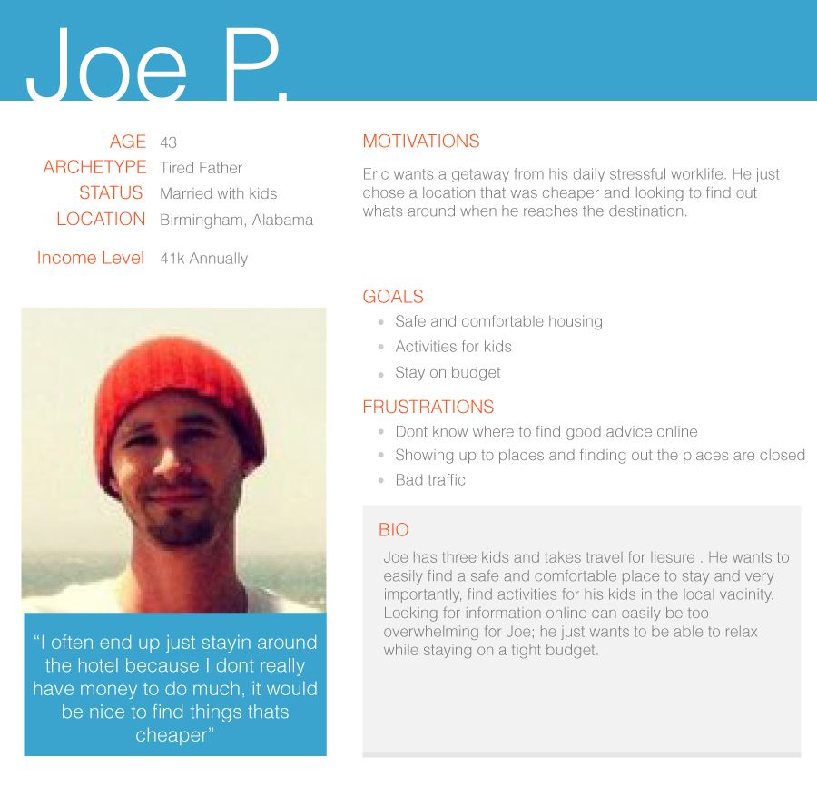
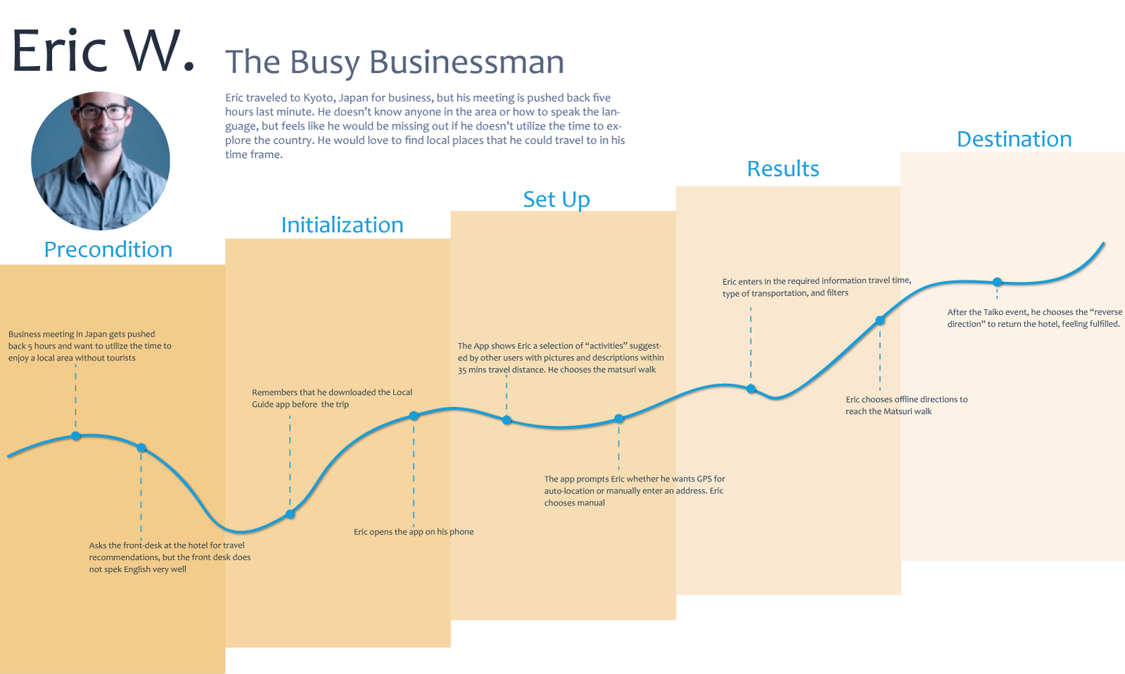
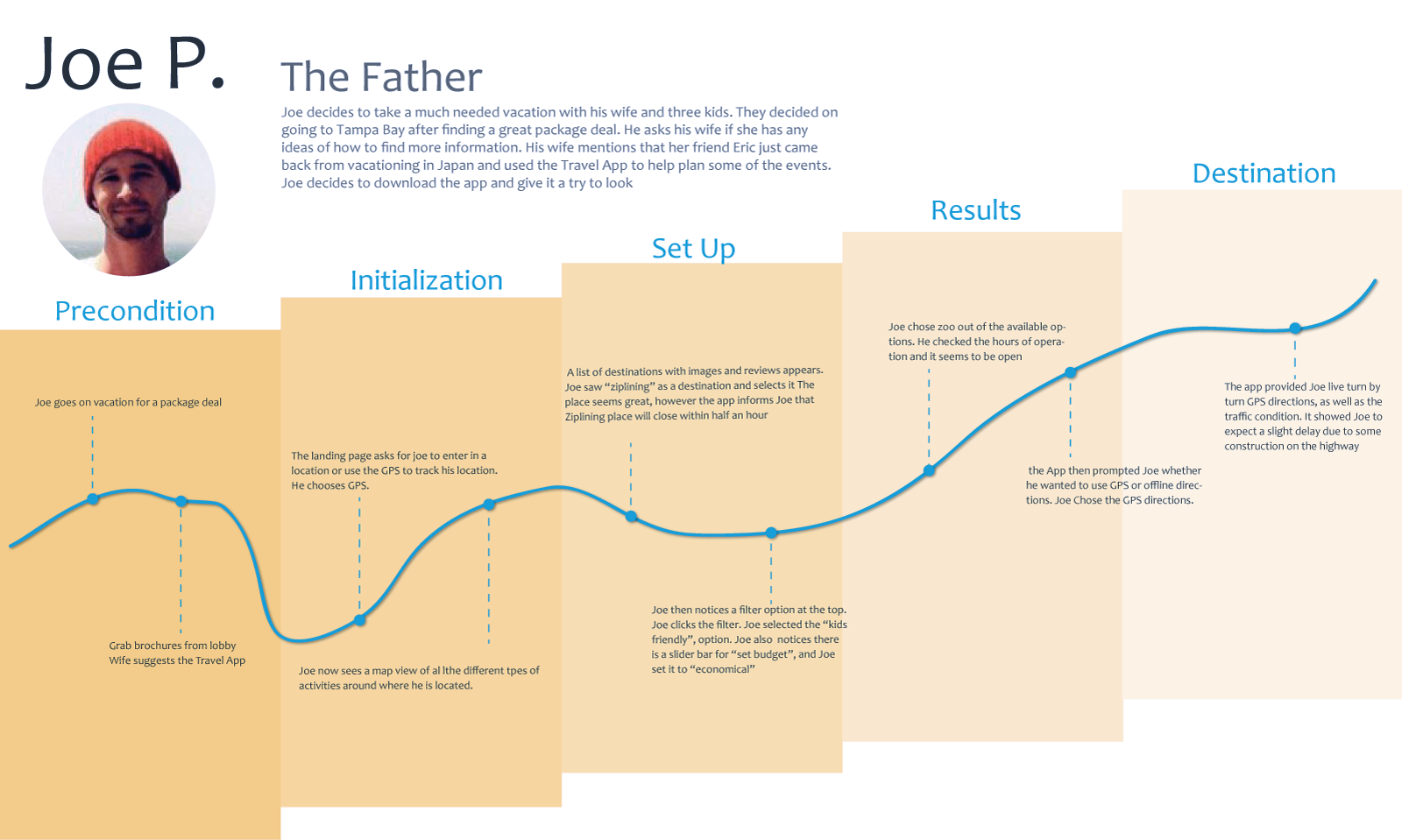
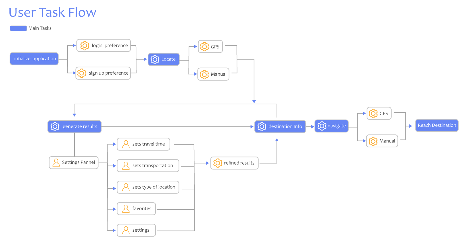
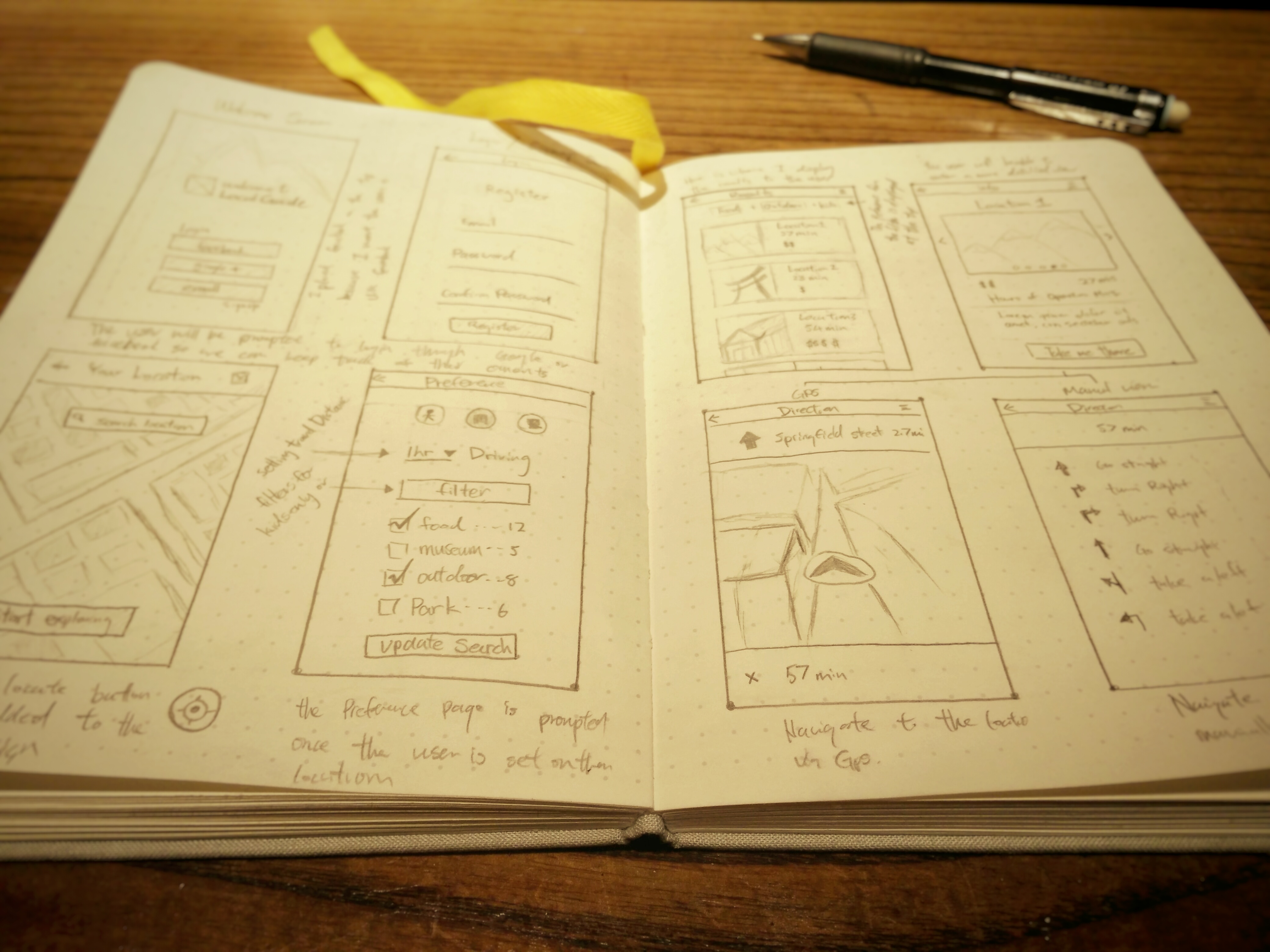
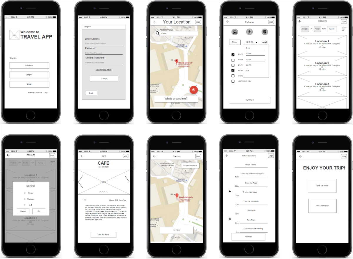
Local Guide is a mobile application aimed to help inform travelers interesting destinations they can visit based on their timeframe, as well as helping them navigate to their destination to create a more pleasant experience for people traveling to unfamiliar places.
I worked on this project as the both the UX and UI designer in collaboration with my design director.
Approach
Tools
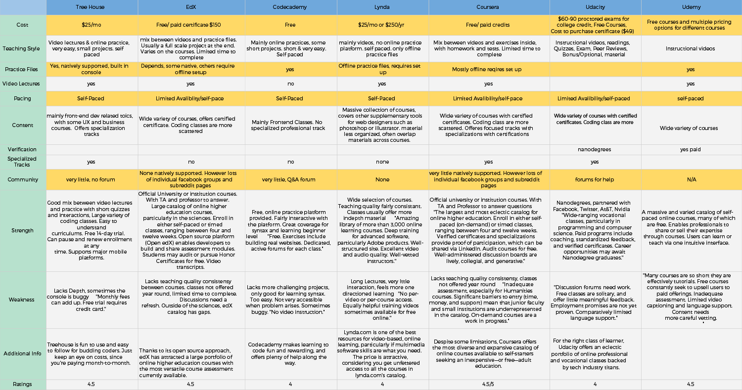
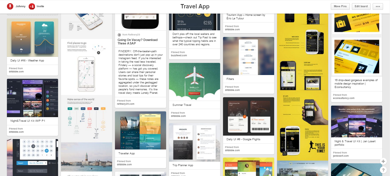
Methods
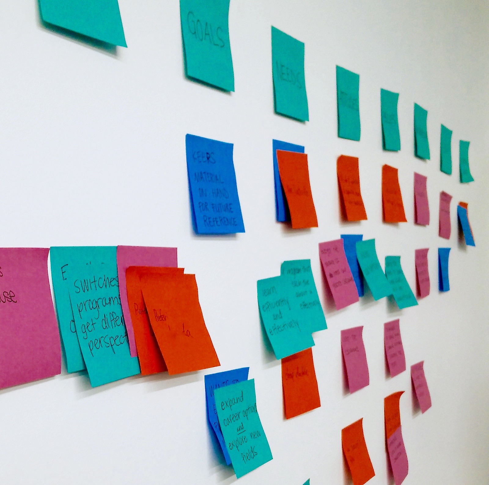
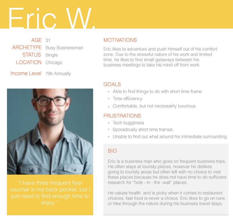
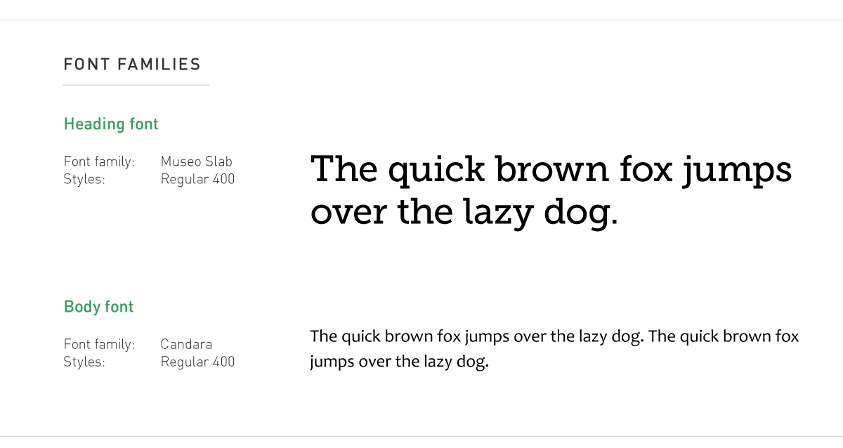
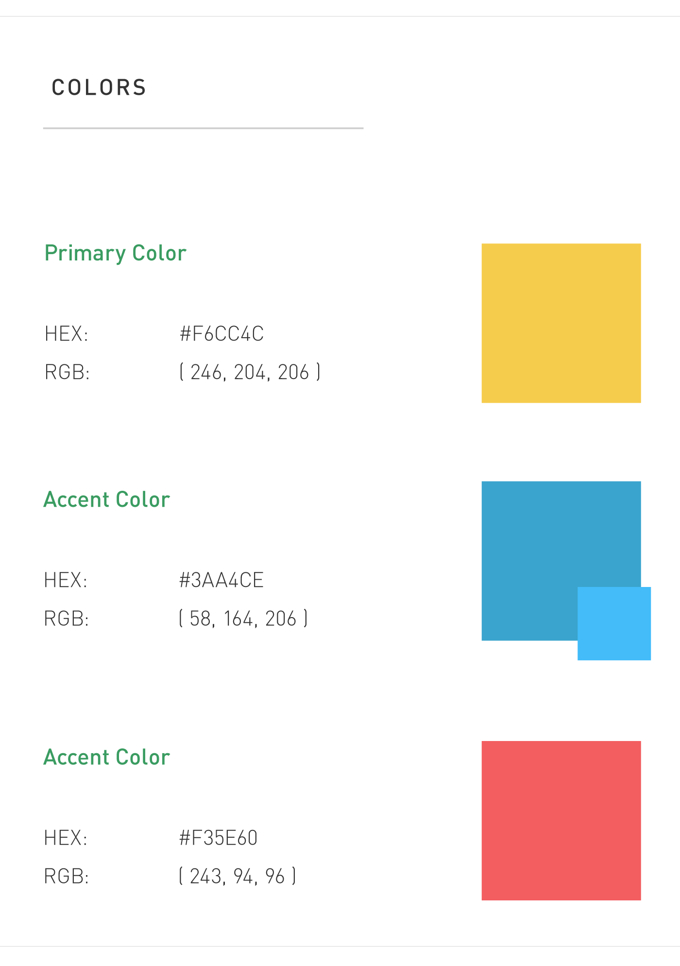
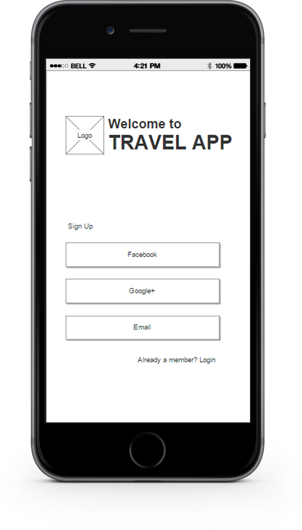
Prototypes (Axure, paper prototype), Adobe Illustrator, user interviews, personas, task-flow, journey map, usability testing, wireframing, story-board, affinity diagraming, mood boarding, style guide.
Project Brief
I was given the general instruction to create a mobile application aimed for travelers. The challenge of this project was to decipher the underlying users goals and constraints for dfferent types of travelers, then figuring viable solutions to address our users' needs


 Projects