Designing a Conversational User Experience for Fintech
Role: Convo UX Architect | Client: Undisclosed
Overview
FinTech
The financial company is one of the major credit card brands in the US with nearly 50 million users.With increasing student loans and the need for young adults to build up their credit, the financial company was seeking to expand their services among the young debit millennial demographic.
I worked on this project as the Convo UX Architect and UX designer on a full scrum team in collaboration with researchers, strategists, product analysts and developers.
Approach
We used the Google Design Sprint, Agile Methodology, as well as Design Thinking to approach the financial chatbot project over 6 weeks
Tools Methods
Proto.io, User Interviews, Surveys, Competitive Analysis, Personas, SME Interviews, Usability Testing, Conversation Architecture, API.ai
Project Brief
The client approached us seeking to create a chatbot taking advantage of conversational UX. We were tasked to conceptualize a solution, design, develop, and test the product.
Research
Domain Exploration
We started our domain research with competitive analysis to understand where the status of other financial institutions are in regards to chatbots, as well as their distinct features and performance.
Key Findings: We discovered that even though many financial services utilize Convo UX through Facebook Messenger, the functionalities are mainly limited to FAQs and looking up information due to limitations of the verification system. Bots that utilizes SMS are also limited to very simple tasks due to limitations of the SMS interface.
Our Users
Following the domain exploration, we conducted user interviews and behavioral observations to understand our user's behavioral pattern. We were specifically seeking for familiarity with technology, frustrations, and their goals. Among the 5 key personas that were made, we identified the major type of users we will be tailoring this product towards.
Key Findings: Here are some patterns observed among the typical users we have chosen. We printed out the persona and kept it on the whiteboard to remind us about the user throughout the project.
Identifying the Usecase
Through our user interviews, we discovered that a simple phrase such as “Transfer $500 from Checking Account 1 to Checking Account 2 monthly starting today” can already have at least 5 variations.
It was evident that there's not a specific pattern that supersedes any other. A student might name the destination first, while an accountant might name the date first from to professional habits.
We uncovered this by asking the users to rearrange cards with variable labels in ways they feel the most intuitive, and have them type it out on the phone for us.
Key Findings: By using Google's API.AI natural language processor to interpret the user's input, we will be able to implement a Random Accessible Navigation which understands the user's intent and allows flexibility for the user to input the variables at any pattern.
Ideate
Personality & Tone
To begin designing the experience, we started by conducting a personality workshop with the stakeholders to set a personality and tone that matches the brand while aligning with our user's demographic.
The personality and tone will decide responses from the chatbot, as well as the look and feel of the chatbot. I designed 3 different types of visual direction, each communicating a different idea from the bot.
Key Findings: We decided style 3 captures the tone and personality of the bot more. We want the users to clearly know they are communicating with a bot, yet the avatar adds a human touch
Conversation Tree
Following the personality workshop, I created a conversation tree capturing different ways a user can approach and complete this task with the personality and style in mind.
Design Principles
From our research, I have decided that here are the 3 central design principles that our product will maintain throughout the experience:
1. Take responsibility: When the user encounters an error, try to frame the responsibility on us. Example: Say "Sorry, it seems like there's not enough money", NOT "Sorry, you don't have enough money"
2. Flexibility for editing: We should account for the user changing their mind at anytime, make editing easy
3. Scannability: By using distinct visual elements, the user should be able to clearly understand the most important information with speed and accuracy
Prototype & Iterate
Usability Testing
To quickly gather user feedback, we simulated the interaction by creating a conversation flow using Botframe to quickly gather feedback on the integrity of the conversation architecture. We included a few more error recovery opportunities from the insights we gathered.
Once we were certain that the conversation worked, we developed the bot using Facebook's React Native framework and conducted further usability testing with accurate representation of the UI Design.
Error Recovery
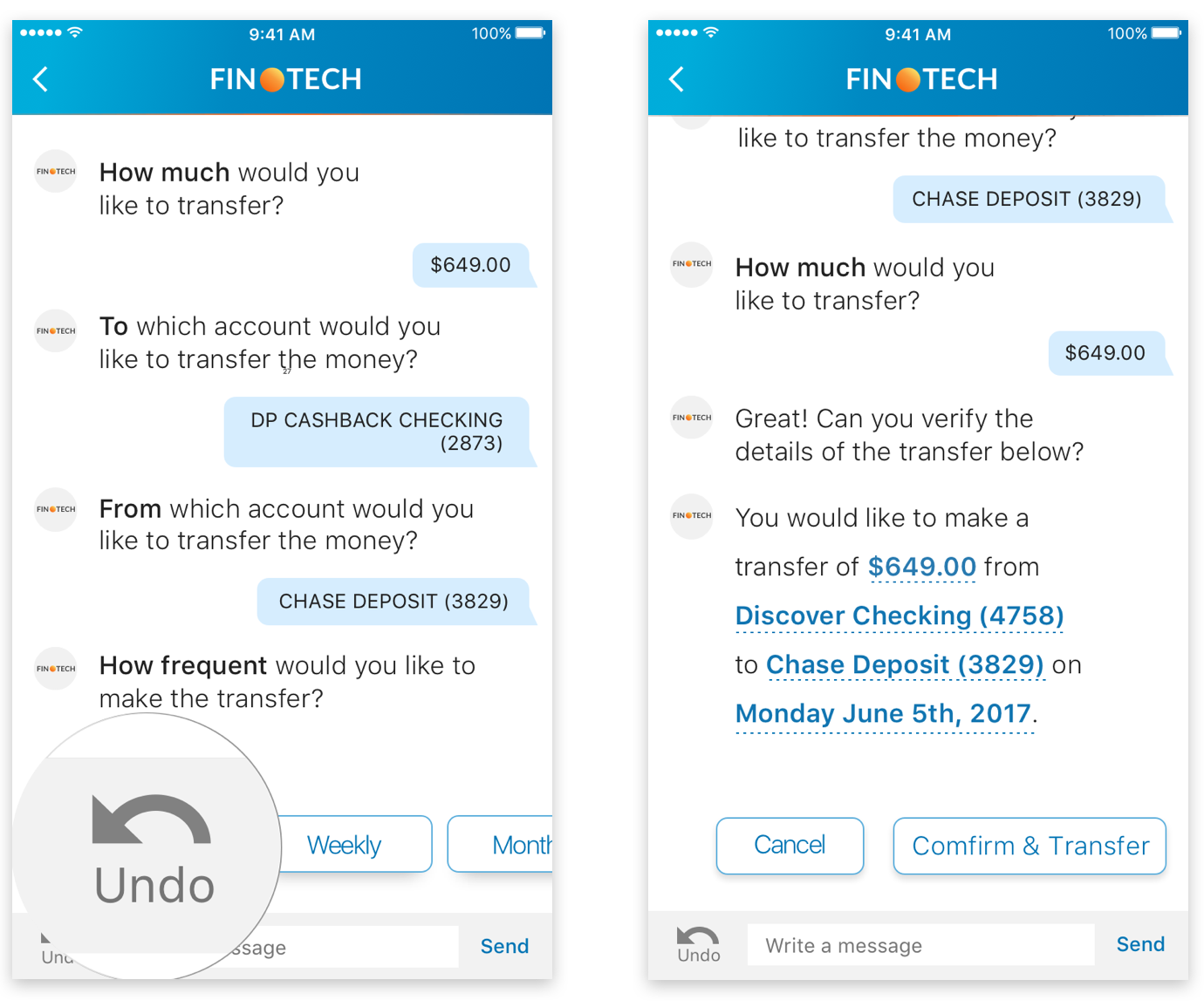
From our usability testing, we decided to include an editable summary at the end of the flow before the user concludes the task providng the user a opportunity at the end to verify all their input in a glance without having to read through the entire conversation for verification.
A second feature we included was the ability to undo an action immediately, if the user made a mistake, the user can click on the "undo" button and the bot will revert back a single state, providing the user an opportunity to correct their mistake.
Key Findings: The ability to edit the final review and undo were some of the most well received features
Scannibility
A major disadvantage of a conversational interface is the lack of variance in UI elements; from the user's perspective, a conversational interface relies heavily on reading the full texts to understand the intended actions.
I designed the phrasing of the conversation as well as using typographical hierarchy to draw attention to the most intended action at the beginning of the sentence. This increases the scannability of the information and the speed for the user to comprehend the intended action.
Key Findings: Testing results proved that the typographical hierarchy helped increase the speed and accuracy for the users
Flexibility
Through usability testing, we were able to identify more synonyms that help the system understand the user's intent in utterances that are the most intuitive to the user.
We designed the bot so the user will not have to wait for the bot to initiate each step of the flow. The user can type in "One time transfer $500 today", and the bot can prompt the user with the remaining missing variables necessary to complete the transfer. This helps reduce the learning curve, cognitive load while increasing the speed at which the user can accurately accomplish the task.
Results
Assessment of Ease
Just because the user is able to complete the task does not mean it was easy to use. During our usability research, we used assessment of ease as one of the key metrics for the proof of concept.
User Confidence
From a financial service and user's perspective, when dealing with money, confidence is extremely important. Measuring user confidence was a key metric for our proof of concept. From testing results, the average user confidence rating is 4.8/5.
App Store Rating
The app currently holds a five star rating on the app store, which means it is important that we continue to build off of the user confidence and maintain the quality of the product.


 Projects